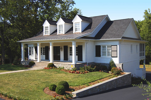
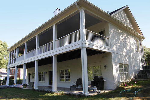
We have begun the processing of the images but I thought this might be a great time to get some feedback. Joshua and I are having a bit of a disagreement about a few elements of the photos so be brutal and give us your thoughts on how the photos look. You'll probably be making at least one of us happy with anything you say so criticize away.
For some reason the blog is cutting off a part of the photo so just click on the image and leave your thoughts on flickr.
If you don't want to play our game with us, then just enjoy the photos of his house. We also worked on verbage for the website since we last posted so you can get the real information that will go on our website.
After the demolition of an existing home in the heart of Green Hills, we acted upon the owners’ desire to create a new home that would meet their needs, while also paying homage to the overall scale and history of the surrounding neighborhood. Porches wrap the front and rear, extending the home’s living spaces. Controlling the overall height and massing, we utilized authentic historic details to create a 4,000 sf home that is charming, approachable and fits in comfortably with its neighbors.


3 comments:
sky looks a little BLUE in the front facing picture... in contrast to the others.
That's my only thoughts... NICE looking place though.
Not sure about the 3rd photo (back porch). Makes the house seem kind of imposing, or "clunky." But maybe just the front was supposed to be charming and approchable. Other than that, however, I am super impressed, Josh(ua). I can't quite imagine having clients of your own, doing all the work yourself. It must be gratifying in many ways. Great work!
I agree with what Nathan is saying. Is there not any way to get more of an elevated picture or maybe one where you aren't so close to the house.
Post a Comment